
Testing a keycap set with a Swiss layout: Tai-Hao’s Hygge
As a keyboard customisation junkie, you don’t have it easy in our little country: almost no manufacturer wants to make keycaps for such a small market. Thankfully, Tai-Hao is now stepping into the breach. I’m looking closely at the set called Hygge.
Taiwanese manufacturer Tai-Hao now offers two keycap sets in a CH keyboard layout. I’m taking a closer look at the Hygge set. One thing off the bat: it’s nice that there are now alternatives to keycaps from well-known manufacturers, but the quality of these specifically doesn’t fully convince me.
The set
The set should make you feel secure – at least that’s what Tai-Hao says. The set’s namesake «Hygge» is a core part of Danish tradition and way of life. Something invokes «Hygge» when there’s a feeling of familiarity, safety, comfort, security and warmth. In Denmark, your family and friends make up hygge. We in Switzerland have to make do with Tai-Hao’s keycaps.
The Alpha keys – those with letters and numbers on them – are white, with turquoise writing. Whereby white doesn’t quite apply. I’d describe it more as ivory. Modifier keys – the rest – are turquoise or blue. In fact, the set exudes a certain calm. I like the simple, understated colours. However, they don’t fit every setup.

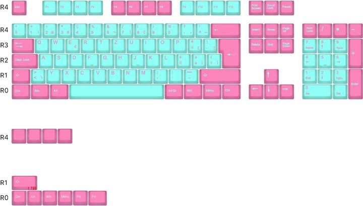
The set includes 116 keys, 12 of which are beyond the scope of a full-size keyboard. Thus, they cover different layouts. Hygge will do for most 60, 65, 75 per cent, TKL and full-size keyboards. However, you should still check if it’s compatible with your keyboard before buying it.
In terms of profile, Tai-Hao relies on OEM. This profile is used by most manufacturers of prefabricated keyboards. You usually don’t have compatibility problems, like with the Cherry profile, for example. Here’s an overview of some common keycap profiles in comparison.

The keycaps are made of PBT plastic. PBT stands for polybutylene terephthalate. Keycaps using this material are usually harder and more durable than those made of ABS plastic, as used in most prefabricated keyboards. The texture and feel are also different. PBT keycaps are usually rougher and more textured, which gives them a better grip. Also, they begin shining less quickly due to fat on your fingers. Of course, there are differences in the processing of plastic. On the other hand, PBT is more complicated and usually more expensive to manufacture, and the colours appear rather pale compared to ABS.
The keycaps are manufactured using a double-casting process. Their inscriptions are cast first, before the rest of the keycap. As a result, the writing never fades.
Manufacturing
At first glance, the set looks well made. The lettering is even and consistent. As evidenced by the ruler that I put on the keys.

At second glance, however, I see several inconsistencies. When placing the ruler on the number row, the 3 catches my eye. It lies higher on the keycap than other keys. The same applies to the 7.

In addition, the labels aren’t always the same size. Depending on how many imprints are on a keycap, this is understandable. But the fact that the Win key has larger lettering than Ctrl or Alt is illogical.

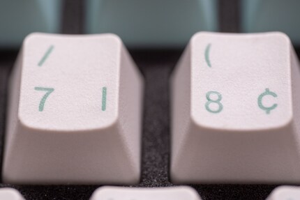
Likewise, lines on the imprints aren’t always equally thick. I especially noticed this when comparing the 7 and 8. 7 is particularly thick, in the upper part of the 8 I suspect that white might’ve flowed into the turquoise during casting.

When I run my fingers over the keys, I sense the characteristic PBT roughness. They feel grippy. However, the lowest row is much less textured than other keycaps. Furthermore, some keycaps – especially those in the number row – feel a bit sunken in the centre. It’s almost like I can feel the stabilisation bar beneath each keycap.

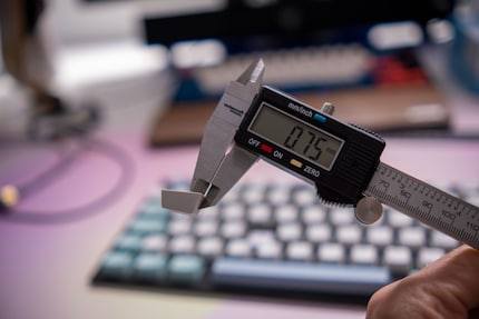
For PBT keycaps, they’re relatively easy to deform. However, this isn’t necessarily due to the material, but to the thickness of the walls. Here the variance is enormous. I measured a range of 0.75 to 1.36 millimetres for various keycaps. The wall facing downwards is usually the thinnest. They’re also relatively easy to bend.

The home row, on which your fingers rest in the ten-finger system, has the thinnest walls. They’re just one millimetre thick. The thickness of a wall mainly determines the sound of the keycaps when typing. As a rule of thumb, the thinner the wall, the slimmer the sound profile. Thicker keycaps are therefore desirable.
In the end, it’s not only the material that matters, but also its processing. In one of my keycap sets from manufacturer JTK, the variance in thickness amounts to a maximum of 0.1 millimetres, all around 1.5 millimetres thick across the board. Although made of ABS, they’re less easily bent than Tai-Hao’s keycaps.
The sound test
Since I write on keyboards using the ANSI layout, I only own one test device from Deltaco, the WK95R, to install the keycaps on. The sound test first shows Tai-Hao’s keycaps, then those of JTK. Please keep in mind that sound tests are subjective and many factors have an influence on them.
Personally, I like the sound of the JTK keycaps on this keyboard better than that of Tai-Hao. They sound fuller, while Tai-Hao’s are a bit thin. However, the keyboard used isn’t the best model to compare keycap sets. It doesn’t sound good anyway, no matter what keycaps are installed.

Verdict: finally, more choice for the Swiss layout
I liked the look of Tai-Hao’s Hygge keycap set initially. It’s colour-coordinated and offers enough keys for most keyboards in the CH layout.
Unfortunately, the build quality didn’t convince me. The imprints aren’t uniform and the walls of the keycaps are very thin, which makes them easy to deform.
I therefore find just over 80 francs too expensive for the set. At this price, I cannot overlook the partly poor build quality. If the set were 20 francs cheaper, I could turn a blind eye to the inconsistencies.
From big data to big brother, Cyborgs to Sci-Fi. All aspects of technology and society fascinate me.


